10.2.12

8.2.12

Wildfox: summer 2012

Im obsessed with the lookbook for Sirene, Wildfoxs summer 2012 collection. I want it to be my life, forever.  
Inspiration? Mermaids. 
Duh.  


6.2.12

Enrico Bevere typography


Fur is the second in a collection of experimental types designed by Enrico Bevere (the first is called Koy and seems to be inspired by sperm?). It looks real to me, but I guess he created it using 3D softwares and then exported them at high resolution with alpha channel...? Pretty cool, even though I have no idea what hes talking about. I wish I did!


 via Typography Served

5.2.12

DIY: fluoro flatwear

I only love this home-made flourescent ombre flatware. It would be so easy to do yourself! This would be a unique way to decorate your table either seasonally or for a specific occasion, like a party or whatever, since the paint would scratch off eventually, and be pretty easy to scratch off yourself, if you wanted to. If only I had my own kitchen I would certainly try this. Maybe I will! In The Future!


4.2.12

Sebastian Wahl collages

Im way into these kaleidoscope collages by Sebastian Wahl. I feel like they remind me of something?


3.2.12

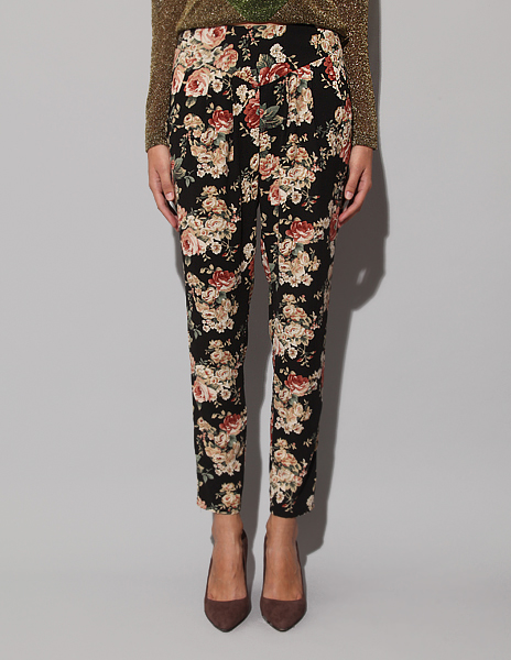
im lovin it: FLORAL TROUSERS


Striped shirt + floral skirt = something of a springtime uniform for me. Its preppy and I like it. But when I moved, I got rid of almost all of my floral skirts. Plus, it isnt spring yet. Whats a girl to do? Buy a pair of floral trousers, of course. Now I know that a lot of whats out there is tacky, and/or made of jersey and spandex (jeggings?) But I didnt say leggings, I said trousers (though I would also accept some tasteful denim). This is what I mean:


 From Pixie Market ($64) & Warehouse ($89)

image of debbie harry via here (thanks, lanie!)

2.2.12

infrared photography

I never ever had heard of infrared photography until I saw the work of these three artists. Admittedly,  I dont know much about the different techniques for taking infrared photos (if you like, you can read more about it here) but I gather that by using different filters and methods of digital manipulation you can produce the various color effects you see in these artists work. Though the settings of their land and cityscapes are geographically rather disparate, each uses infrared photography to create altered images that are at once beautiful, bizarre, and a little eerie.


Maria Netsounski shoots tropical locales, and then manipulates them to look cool and wintry. I like the simple color palette, and those darkest skies and whitest palm trees look crazy. These look like scenes of some alien planet youd see in a science fiction movie.


Yiu Yu Hois Hong-Kong cityscapes are more like something out of a dream than science fiction. Like a flash-back scene in an anime, the glowy pastel tones he creates impart a hazy, ethereal quality to scenes that are otherwise rather quotidian.  


The subject of Richard Mosses Infra series is the war-torn eastern Congo. He used Kodak Areochrome, a discontinued film with infra-red capabilites once used for military surveillance, which changes the green in his landscapes to varied shades of pink and purple, while the greys and browns take on a strange blue-green cast. Though this series has the brightest colors of the three, to me its images are somehow the darkest.