Showing posts with label colors. Show all posts

16.7.14

knowing that i'm ALWAYS red


When is the new episode of Sailor Moon going to air, you guys?! amirite?! What's a #boredhousewife supposed to do with her free time (ie evenings from 9-10pm) upinhere? Who even knows what Japanese programming schedules are like, in this day and age especially?

Luckily I thought of a perfect peach of a kindred spirit of entertainment to watch in the mean time. After all, the Sailor Scouts and the Heathers have more than a little in common, each a power group of gorgeous, sassy high-school girls who use their powers of cosmic and/or social persuasion to get ahead in the evil world around them, occasionally resorting to violence when necessary. 


Obviously, it's not entirely analogous; It's more like if Usagi et al had been recruited by scouts from the Negaverse, instead of talking cats from the Moon Kingdom. Or, like a reboot prequel series following Queen Beryl during her formative years back at Negamoon High (which is actually a pretty good idea…) So, yeah, it is a little different, but I think you see connection. And there's more than a passing resemblance between the dark, devil-may-care lotharios JD and Tuxedo Mask… Anyway, probably my favorite element shared by these two cliques is that each girl has her own signature color. I don't know why, but I've always loved that--all the way back to the Color Kids! It's like the personification of hue, but also it's such a cool way to establish the mood of a character. Because you can always pick apart color symbolism in a piece of  media (especially Heathers) but you don't really need to, because you can just use your eyes! It's sort of like what Schopenhauer said about sound and the will (but obviously, as it pertains to visual rather than auditory qualia);  you could think of countless ways to describe the feelings and references invoked by a color, or you could just take a look and feel it all at once. Do you know what I'm talking about?

So, which color would you choose?


Red?


yellow?


Green?


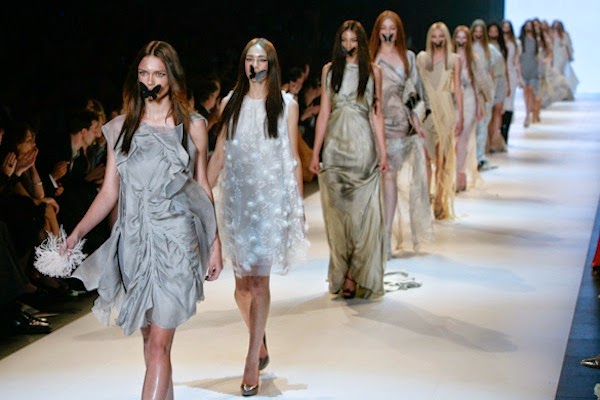
or blue? And, could you commit, like these people have? Sometimes I think I could… but I'd have to make up my mind about it first. So, really, I couldn't.

Something interesting I noticed watching this film the last time around is that Veronica only really embraces "her" color after Heather dies (#spoileralert) Before, she has little accents of blue in wardrobe of mostly black and grey; after the murder she's literally wearing it head to toe (thanks to some truly questionable hat choices). But even though she eventually owns her power color, she still claims the red scrunchie of true power in the end. It's all so subtle, but obvious. Red and blue is the best color rivalry of all time, and this film is a great example of it. It's like choosing between good and evil but you can never be sure which one is which. I wish I could explain it better but like I said, I'm pretty sure I don't actually have to! 


25.4.14

OR-you-CHID-ing me?


I know you guys probably think that I only talk about Felix these days, but despite all evidence to the contrary, I care about other stuff, too! Like, I don't know, fashion!? Honestly? I was largely unimpressed with most of what I saw last fashion week(s), whichever season they were (see? I don't even remember). But maybe that's because I wasn't paying any attention to the land down under, as they call it. Case in point: how amazing do these ladies look, all dressed up in Toni Maticevski's spring/summer 2014 collection, recently shown at Melbourne Fashion Week?


So fresh! So disturbing! Even a little distracting--the flowers are all I really remember from the collection, which otherwise failed to speak to me despite its being technically rather impressive. It could be that I'm just hard to please--maybeit'sjustmebutforme, not even Rachel Comey is getting it right these days! Regardless, this here is working for me. I haven't been so impressed by a runway accessory since those Balenciaga halos last spring (remember?) He did the same trick with butterflies in 2012


but I much prefer the blooms, don't you? 

Incidentally, if you happen to like things like orchids and butterflies, and you live in Pittsburgh, you should really check out Phipps Conservatory, our local botanical gardens! I recently became a member and I'm so glad I did, as it's probably the most beautiful place in town. I might even try to make it to one of the Tropical Parties coming up this May--hopefully, sporting a head full of orchids! 


24.12.13

she's a colour queen


Thanks, British Vogue, for your groundbreaking research. So, how do you think your wardrobe color representation would break down, annually? Like HRM, I also favor blues and florals, naturally. But if you ask me,  4% is altogether too much orange. 

Can't wait til they follow Kate!

28.9.13

color story

I wish I had something slightly more juicy to report to you, dear readers, than the fact that I happen to have a favorite color these days. Oh well! Lately, we've been making some real strides towards getting our apartment all set-up cozy-like, for the winter. And all of the sudden, the color pink seems to be everywhere. Like, not all over everything, but you can see it here and there, everywhere you turn. I'm even drinking pink wine right now, you guys! It's dry and greek and goes great with a pizza pie, just so you know. All year long, I've had this thing about pink, where I just can't seem to avoid it. It has a funny knack for setting the kind of mood I like around the house. The kind of pink I'm talking about isn't girlish or garish; its creamy and dreamy and rosy and cozy, like seashells and clay and strawberry milkshakes. It all started (again) a few weeks back, as I found myself daydreaming about Claude Monet's house at Giverny. Remember?


Pink brick--what could be better? I would live in that house for the rest of my days. I wanted to see if Monet had ever painted the house itself, because how beautiful would that be? As far as I can tell, he didn't--he wasn't too concerned with architecture, after all. But while searching I did stumble across this painting by Kenneth Eugene Peters


which I find very captivating, namely largely due to the colors he's used. It calls to mind, firstly, Solange Knowles outside that erstwhile pink park slope brownstone for the "Locked in Closets" mini-video she did with Refinery29 back in May:


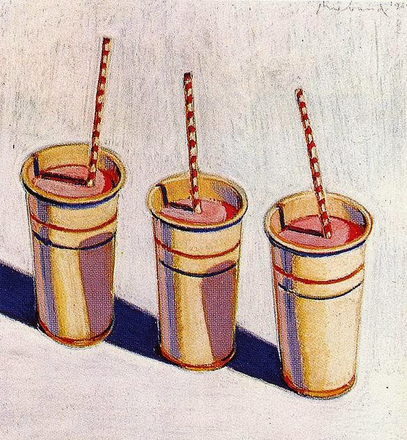
and also and more obviously, the work of Wayne Theibaud, clearly (I assume) a major influence of Peters', whose confectionary paintings in particular feature just my kind of sugary, sea-shell pinks:


So tasty! These, in turn, are exactly the same pinks you see "Pink Lady," this editorial starring Cara Delevingne, featured in the September issue of British Vogue


Which calls to mind this other recent Lab Magazine editorial, Nykhor in Bloom, for obvious reasons


See? So edgy, so moody. I know that its tempting to designate pink a certain limited realm of application. But the more you think about it the more you like it, in my experience. Pink is truly intriguing! Especially when you think of it as light red. Long-time readers and people generally in the know will recall that, prior to the 20th century, pink, a lighter version of red, the color of blood and war and power, was for baby boys, while blue, the color of the virgin mary, was for girls. And why those two colors, I often wonder? It could've been pink and green or blue and yellow, anything. It's one of those arbitrary dichotomies, like chocolate and vanilla: efforts in marketing have lead us to consider them "opposites" when, if you think about it, there's really no justification for it. Can't everyone just eat and wear whatever color they like without being forced to choose sides? Why do I have to have a favorite color, at all?

images via here, herehere, here and here


22.8.13

poisons, potions, and pistachios

Have you ever been obsessed with an ingredient? For me, right now, its Pistachio Paste, though in truth, its more of a syrup--which is important, because its liquid glossiness is mainly what I find so compelling (its hard to imagine being enamored of an actual paste) The combination of aforementioned translucent syrup-iness and an evil, disney-villaness shade of emerald is something I find altogether enchanting. Like molten green glass. Like some deadly delicious poison anyone could be tricked into eating, by magic or persuasion--and was there ever anything tastier than an Essence of Nut? Pistachio, praline, almond... O to be a pastry! But, more on that later. Back to the paste. I want to call  it "lurid" even though I know that's not the word at all. And how disappointing! It sounds exactly right, so why can't it be? "Verdant" won't do; its the difference between vegetal and toxic. 


painting, tobias toberacollage, ben gileswatercolor molecular illustration, david s. goodsell;
japanese lithograph illustrations of Louis Vuitton a/w 2012, jules julien 

Isn't it funny how texture can affect our perception of a color so dramatically? The reason this substance seems sinister must have something to do with my subconscious reaction to the particular combination of sheen, viscosity, and hue.  In an interview I read recently about his new line of cosmetics, Marc Jacobs says that "shiny" is his favorite color. That guy! Though, given my obsession with a can of green syrup, I think I can relate. But why are shiny things so captivating, really? I've got this theory, which I'm sure is not original, that when you break it down, we find most things beautiful because they look like babies, sex, or the food we ate when we still lived in trees (namely, fruit). If that's true, I've answered my own question. Actually, it may even explain why that shiny green seems evil to me: to to my ancient primate brain, the texture says sap, honey and nectar, but the color, even though I'm attracted to it, gives me pause. I mean, maybe, right? Color theory sure runs deep. And, also, its tricky!


1.5.13

feel the prep

I was having a hard time deciding which color should represent May, officially, in my color-comprehension of the calendar. Theres no guiding holiday theme, and no one hue that dominates; I always picture April Yellow against a drab, pre-bloom background, but now that spring is properly underway, virtually every color of the rainbow is in its prime. Clearly, one color simply isnt enough for so merry a month! So, because May is my birthday, Ive decided it can have two: quintessentially springy, the combination of Pink and Green evokes a suitably festive atmosphere for my birthday countdown, and looks so much fresher than the navy and white I wear year round by default. And luckily enough, Im professionally obligated to favor it. Which brings me to my second color-related point. I dont know about you, but springtime makes me want to Shop For Clothing. But six out of seven days a week, I work for the Best Bakery in Pittsburgh, where strictly speaking, the uniform is white shirts and neutral-colored trousers. Obviously, its hard to get excited about buying a new white shirt, and its silly to buy clothing you can only wear one day out of the week. But the other day, fresh out of clean white tops, I took a chance and wore green-and-white stripes to work instead. And my boss (who is, by all accounts, very discerning) loved it! Apparently, anything Prantls green is fair game, provided it looks clean and professional, of course. I also believe I overheard that if something matches the shade of pink on our shopping bags exactly, then its cool to wear to work, too--though I think that applies only to bottoms, not to tops. Anyway, this new information has helped me channel my fantasy-window-shopping energy considerably--because, its ok to daydream about buying work clothes. Right?


Provided they were a good match, wearing pink skinny jeans would improve my mood considerably--though I probably wont be buying the Marc Jacobs floral shorts. And as much as Ive grown to love J.Crews new Punk-Floral print, wearing that silk blouse to the bakery would be madness, as I dont think dry-cleaning can do anything to remove buttercream. So this is, for the most part, the stuff of sartorial speculation. But! These color-blocked Sperry Topsiders are the perfect the perfect shoe for working at Prantls! Practically speaking, I bet they provide good traction, and wear pretty well over the course of the day, comfort-wise. But most of all, those are Prantls colors exactly. Theyre seriously a perfectly perfect match. Of course, behind the counter, none of our customers would be able to see them... but my oh my, wouldnt my co-workers be impressed!

Quick, Somebody! Take me shopping!

for item information, see my polyvore collage