
I wish I had something slightly more juicy to report to you, dear readers, than the fact that I happen to have a favorite color these days. Oh well! Lately, we've been making some real strides towards getting our apartment all set-up cozy-like, for the winter. And all of the sudden, the color pink seems to be everywhere. Like, not all over everything, but you can see it here and there, everywhere you turn. I'm even drinking pink wine right now, you guys! It's dry and greek and goes great with a pizza pie, just so you know. All year long, I've had this thing about pink, where I just can't seem to avoid it. It has a funny knack for setting the kind of mood I like around the house. The kind of pink I'm talking about isn't girlish or garish; its creamy and dreamy and rosy and cozy, like seashells and clay and strawberry milkshakes. It all started (again) a few weeks back, as I found myself daydreaming about Claude Monet's house at Giverny. Remember?

Pink brick--what could be better? I would live in that house for the rest of my days. I wanted to see if Monet had ever painted the house itself, because how beautiful would that be? As far as I can tell, he didn't--he wasn't too concerned with architecture, after all. But while searching I did stumble across this painting by Kenneth Eugene Peters

which I find very captivating, namely largely due to the colors he's used. It calls to mind, firstly, Solange Knowles outside that erstwhile pink park slope brownstone for the "Locked in Closets" mini-video she did with Refinery29 back in May:

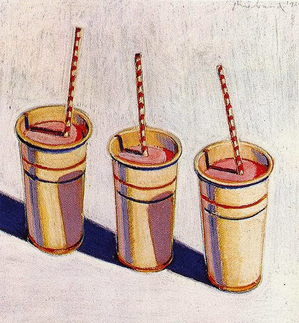
and also and more obviously, the work of Wayne Theibaud, clearly (I assume) a major influence of Peters', whose confectionary paintings in particular feature just my kind of sugary, sea-shell pinks:


So tasty! These, in turn, are exactly the same pinks you see "Pink Lady," this editorial starring Cara Delevingne, featured in the September issue of British Vogue


Which calls to mind this other recent Lab Magazine editorial, Nykhor in Bloom, for obvious reasons


Pink brick--what could be better? I would live in that house for the rest of my days. I wanted to see if Monet had ever painted the house itself, because how beautiful would that be? As far as I can tell, he didn't--he wasn't too concerned with architecture, after all. But while searching I did stumble across this painting by Kenneth Eugene Peters

which I find very captivating, namely largely due to the colors he's used. It calls to mind, firstly, Solange Knowles outside that erstwhile pink park slope brownstone for the "Locked in Closets" mini-video she did with Refinery29 back in May:

and also and more obviously, the work of Wayne Theibaud, clearly (I assume) a major influence of Peters', whose confectionary paintings in particular feature just my kind of sugary, sea-shell pinks:


Which calls to mind this other recent Lab Magazine editorial, Nykhor in Bloom, for obvious reasons


See? So edgy, so moody. I know that its tempting to designate pink a certain limited realm of application. But the more you think about it the more you like it, in my experience. Pink is truly intriguing! Especially when you think of it as light red. Long-time readers and people generally in the know will recall that, prior to the 20th century, pink, a lighter version of red, the color of blood and war and power, was for baby boys, while blue, the color of the virgin mary, was for girls. And why those two colors, I often wonder? It could've been pink and green or blue and yellow, anything. It's one of those arbitrary dichotomies, like chocolate and vanilla: efforts in marketing have lead us to consider them "opposites" when, if you think about it, there's really no justification for it. Can't everyone just eat and wear whatever color they like without being forced to choose sides? Why do I have to have a favorite color, at all?
images via here, here, here, here and here
No comments:
Post a Comment