31.8.12

im lovin it: D&G SOXX

Dolce & Gabbana is killing it these days. In terms of showmanship, they definitely had the best fall collection, and Ive already mentioned how I love the corresponding campaign. But did you notice the footwear? Specifically, did you notice the socks? I love them! What with the sheerness and the embellishment and the lace and the embroidery... such a sweetly subtle way to add some fancy to an outfit, and a good way to make skimpier shoes more comfortable when the weather turns cooler. Isnt it nice that something so practical as sock-wearing can look so sophisticated and beautiful? 


images via style.com

29.8.12

how cute is...

this Fuji wallet/tissue holder, by goodbymarket? Leave it to the Japanese to make something so adorably hygienic. Tissues are of course always useful (yet somehow difficult) to have on hand, especially when you have a baby toddler and all of the sudden youre constantly about to have mush/grease/goo all over you because of how sticky they always are. Having a tissue dispenser built into ones coin purse would ensure youd always have one handy--provided you remember your coin purse, which is also useful and important. But how could you forget to bring along something so precious?
image via here

sweet dreams are made of this

Chase and I just returned from a super-relaxing overnight hotel stay, sans bebe, at a local Holiday Inn. It was very comfortable, they had a spa, and we even had a voucher for a free meal, which wed won in a raffle at the May Ball. All in all, it was delightful, and just what we needed. So refreshing! Lovely as it was, however, it cant really compare to this family-villa-cum-hotel, La Minervetta, that was featured in last Sundays stella magazine. Usually I dont pay attention to hotels, but this one is so beautiful! The airy white walls, punctuated by splashes of pseudo-primaries--red-oranges, golden yellows, ocean blues--for example, that liquid-like cerulean tiled floor in the lounge. Swoon. And of course I love the striped and checked patterns seen on walls, cushions, and in the tile work in one of the best bathrooms ever (unfortunately, not pictured here)... not to mention hotel owner Marco De Lucas beautifully colorful and ornate ceramics collection that features throughout the villa.
 And just look at this bedroom, with its wall-to-wall windows, preppy/nautical interior, and beautifully practical wide wrap-around window sills.
Can you even imagine waking up to that in the morning?Its basically exactly how Id like to decorate my own home, given the resources--amalfi coastal views and all.  Plus, wouldnt it be the perfect place for, I dont know, a honeymoon?

Sigh.
images via here & here

27.8.12

get a grip!


So, I recently cut bangs, and then almost immediately began growing them out again. TYPICAL. I dont know what it is, I used to have bangs all the time and I thought they suited me so well, but this time around something about them didnt feel right... like, they feel too fussy, or deliberate, or something. Like hair looks better if it just grows out of your head the way it comes naturally, without a lot of imposed architecture. Anyway, Im at that part where my bangs are too long just to be in my face, but too short to  sweep to the side effectively, let alone tuck behind an ear. Which means I have to pin them back every day, and I dont like that! Something about having a bunch of bobby pins in my head reminds me of being in junior high (in a bad way) and its been bumming me out. Only, then I saw the way these ladies were styled for the Cacharel fall runway show. They all look decidedly more twenties gamine than awkward fourteen year old, and it made me feel a whole lot better. Apparently, bobby pins (kirby grips?) are a big deal for hair this fall. British Vogue told me so. And that made me feel better, too. 

image via here

the perfect thing!


Having just spilled yet another cup of tea that was balancing on the arm of the sofa in order to keep it out of reach of a hand-sy toddler, I can tell you that this idea for a wooden wrap-around side table is the. perfect. thing. One of my first DIYs for when I get my own sofa. How hard can it be?

image via here

25.8.12

malika favre plays hide&seek


Usually Im not a fan of places whose names ought to start with a C but instead, presumably in order to appear cute or quirky, start with a K... but, because I am a big fan of Malika Favre, Im willing to forgive the Kemistry Gallery this offense, as theyre  about to play host to her newest exhibit, Hide & Seek, from the 6th to the 29th of September.  For the prints in this show, Favre used patterns seen in mundane and repetitive architecture to create what she calls an Optical Experiment. It probably wont be as sexy as some of her previous work (you may remember her racy cover-design for the Kama Sutra, which I posted about some months ago) but it does star an intriguing and sophisticated woman, who hides from the viewer amongst the different patterns. So flirty. Check out the teaser trailer:


I hope I can get to london while its still showing! 

24.8.12

imlovinit: OXBLOOD

The name of this color suits it perfectly: dark, moody, romantic, intriguing. This  deep brownish red lends itself particularly well to leather accessories, playing the part of a neutral, but with considerably more visual interest--perfect for investment pieces--say, a several-thousand-dollar suede tote, or skull-embellished ballet flats, by Alexander McQueen, for example... or, anything you want to last you a while. A safe bet but without being boring, it pairs well with practically anything, and wont look out of place in a few years time when other colors may seem too last-season.  Who would want a black leather jacket when you could wear this one by All Saints? Same goes for the rest of these leather accessories, including the  Theres also something sort of nineties-grungy-punk about oxblood that makes me like it even more; for example, these patent leather mary-janes from topshopthese lace-up brogue boots by Marc Jacobs, or this adorable heart-shaped satchel designed by Agyness Deyn for Dr. Martins. So unique and cool but again, totally versatile and wearable. 

21.8.12

illustrations by antonio

Maybe if you went to fashion school, or are just more aware of things generally, you already know about Antonio Lopez, fashion-illustrator extraordinare--but Id never heard of him until I saw some of his work on the Wildfox blog yesterday. The pictures above are from taken a story he did for British Vogue in 1968. So cool those girls are, and with such attitude--as are the ladies in this next spread, which I like even better, from Elle Magazine in 1967. 

Such nonchalance. Apparently, no one better captured the feel of the sixties, seventies, or eighties in fashion illustration. Im not as big of a fan of his work from the eighties, as its not a style I respond to as favorably... but you cant deny how eighties they are. Id love to see more of his work!

images from here and here

illustrated idioms

Its so cool to learn idiomatic expressions of other languages. Not only do they usually sound silly in translation, they can tell you about the values and lifestyles of the people that use them. Id never really heard any Arabic idioms before, but Egyptian illustrator Hussien Ouf has taken a handful and illustrated them using beautiful calligraphy.  Check them out (the last one is my favorite!) 
Every mustache has its scissors

Prefer a carat of luck, than an acre of skill

Saying I dont know is a relief to you, my soul

They told the cock to crow; he told them everything is great on its right time

Something you dont care about, let your father-in-law take charge of it. 


Good advice all around. Of course it helps that the written arabic word is so beautiful... but this would be a cool typography project in any language, I think. Which english idioms would you choose to illustrate?

19.8.12

A Clean Slate

Oh how I love British Vogue being my normal Vogue... so much nicer than the american version, in my opinion. Having said that, I didnt buy a copy of the July issue and so I missed this supes autumnal fashion spread, A Clean Slate, shot by Josh Olins and starring Suvi Koponen. I love practically everything about it. The colors combined comprise the perfect fall palette; cerulean and rust, as seen above, is one of my fav color combos. The layering is sharp, yet casual and slouchy. What with the color blocking, the layering, and the styling--glossy skin, messy-but-not-too-messy hair--this shoot is sort of evocative of a J.Crew catalogue--though thanks in part to that abstract cat-eye, infinitely hipper and less prissy.Speaking of which: the conceptual, geometric cat-eye is going to be huge for fall, I believe. This is the third time Ive seen it this week; other sightings include the runway makeup for Kenzos fall/winter runway show (among others), and Emma Watson on the cover of T Magazine last week. 

images via mode

18.8.12

babealertx3: DOWNTON LADIES

holy crinoline! check out Downton Dames Michelle DockeryLaura Carmichael, and Jessica Brown Findlay, looking smokin hot on the cover(s) of Love Magazines Issue 8. I was especially taken aback by Carmichaels cover--she does such a good job playing frump-master Edith on the show that its easy to forget how beautiful she can be in real life. O.m.golly I cant wait for season 3! Looking good, ladies!


images via LoveMagazine

17.8.12

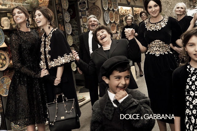
Dolce & Gabbanas Happy Family

This, along with the preceding spring campaign, is probably my favorite fashion ad campaign of all time. Its nice to see old people and children not just included, but featured--often center stage. Its so vibrant, endearing, (seemingly) authentic--and, above all, happy! A welcome change from, I dont know, pretty much ever other fall campaign ever. Plus, what perfect casting! Doesnt it make you wish you were Sicilian (and rich and beautiful)?! So so badly?
images via here

16.8.12

idontgetit: FRAGGLE FURS FOR FALL

While Im well aware that not everyones shopping purchases are motivated by the same practical needs as mine own, and that there truly are people who spend thousands of dollars on clothing specifically intended as party wear, I nevertheless cannot wrap my head around this fall trend of scraggly disco fur. Differences in opinion notwithstanding, I find it aesthetically unappealing and moreover, downright tacky. I mean, sure its fun to dress for fun... but take a moment to consider the following looks (listed from most to least palatable, so bear with me, people) from these fall 2012 ready-to-wear collections:


or (and this is definitely the worst) moschino cheap and chic

...and tell me honestly that you think they look good. Or that you would wear any one of them. Ok so maybe theyre fun and silly or whatever, but is that really an image in which you would want to invest thousands of dollars? So Dries Van Noten isnt so bad, and sure, you can call Moschino kooky-cute if it makes you feel better, and I suppose the collection from Marc Jacobs is jaunty in its way... but would you truly wear one of those hats out on the street, in real life?  Plus, imagine trying to maintain any of that fur in a way that keeps it from looking like a sad old puppet. You simply couldnt! (because they already do...) And even if you could, its not like youd be caught dead wearing any of it next year... amirite?! or what?!

images via style.com